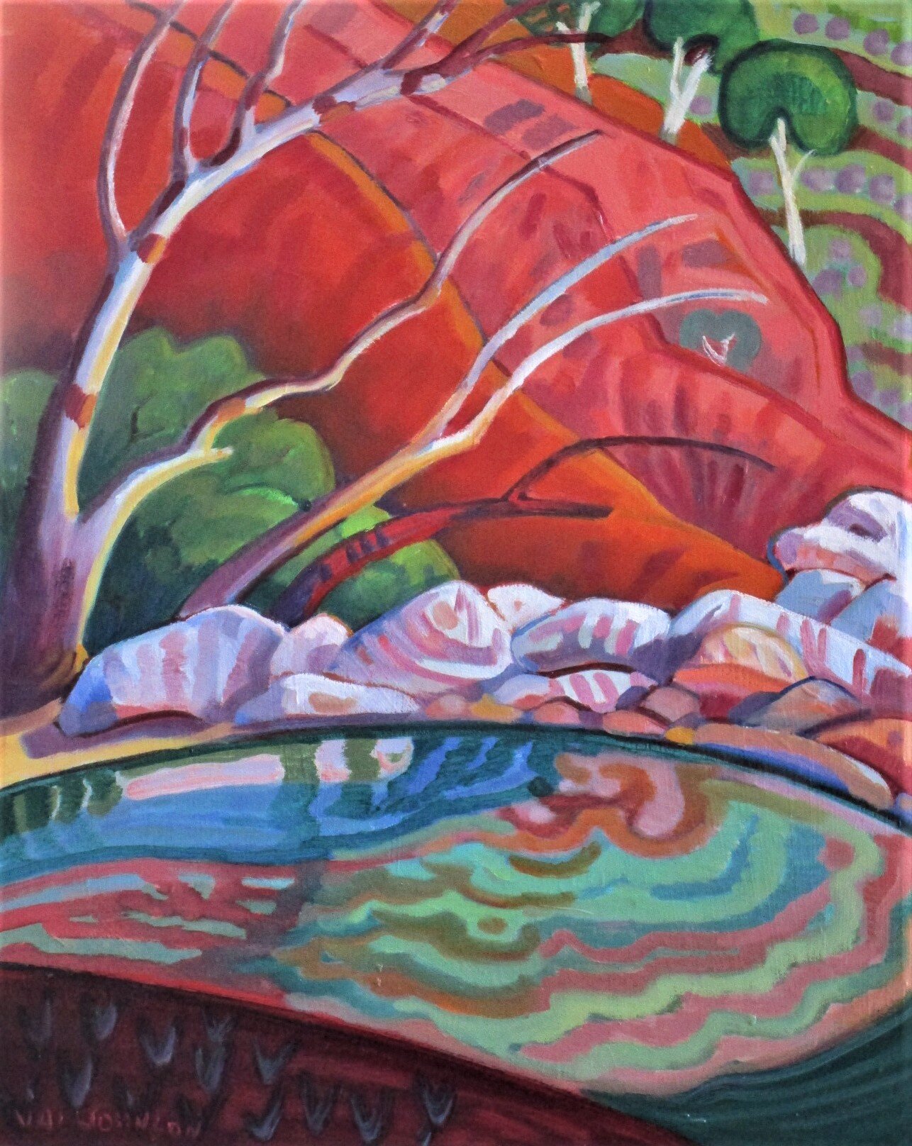
Some Notes on Composition
Composition crosses all boundaries, whether it is still life, portraiture or landscape painting. Here are a few hints.
Have one focal point. If you can see a number of pictures in your picture then it is not good composition.
Keep the focal point to one side, never in the centre.
Repetition. Repeat shapes, this adds to the design. A composition with more repetition and shapes is more interesting than one with less.
Vary textures. Have a variety of treatments in your work. eg, detail the main area, understate the rest. Use thick and thin paint, scrape back with a palette knife. Use some lines.
When painting a still life, it is interesting to break the straight line of a table with a drape, or an object that hangs over the edge and creates a shadow. Look at the work of Chardin
Portraits are better if the subject is slightly to one side, not in the centre of the canvas. You can crop parts of the figure if it adds to the design or the idea you have.
Look at the negative spaces for design in your work.
If working from photographs, do a few tonal sketches first to work out the composition. Photos are great for reference, but are very flat, and the colour is not always right. If you are out painting, do some sketches and take colour notes. This will be a better reminder than just a photo – the camera never sees what you saw.
Verticals, eg, trees, fence posts etc can be varied in height and width in relationship. Objects in still life can vary in relationship to each other, eg, distance and height between objects, and the negative space around them.
Explore what you want to say in a series of tonal drawings, exploring that the elements of shape and relationships go together.
Atmosphere. The hardness or softness of an edge is important, as is the correct tone. The fauves were masters of using tone with unreal colours. Remember if the tone is right, you can use any colour you like. All this adds to a good composition.
